What Statistical Test Do I Use for Continuous Numerical Data
This tutorial is the third in a series of four. This third part shows you how to apply and interpret the tests for ordinal and interval variables. This link will get you back to the first part of the series.
- An ordinal variable contains values that can be ordered like ranks and scores. You can say that one value higher than the other, but you can't say one value is 2 times more important. An example of this is army ranks: a General is higher in rank than a Major, but you can't say a General outranks a Major 2 times.
- A interval variable has values that are ordered, and the difference between has meaning, but there is no absolute 0 point, which makes it difficult to interpret differences in terms of absolute magnitude. Money value is an example of an interval level variable, which may sound a bit counterintuitive. Money can take negative values, which makes it impossible to say that someone with 1 million Euros on his bank account has twice as much money as someone that has 1 million Euros in debt. The Big Mac Index is another case in point.
Descriptive
Sometimes you just want to describe one variable. Although these types of descriptions don't need statistical tests, I'll describe them here since they should be a part of interpreting the statistical test results. Statistical tests say whether they change, but descriptions on distibutions tell you in what direction they change.
Ordinal median
The median, the value or quantity lying at the midpoint of a frequency distribution, is the appropriate central tendency measure for ordinal variables. Ordinal variables are implemented in R as factor ordered variables. Strangely enough the standard R function median doesn't support ordered factor variables, so here's a function that you can use to create this:
median_ordinal <- function ( x ) { d <- table ( x ) cfd <- cumsum ( d / sum ( d )) idx <- min ( which ( cfd >= .5 )) return ( levels ( x )[ idx ]) } Which you can use on the diamond dataset from the ggplot2 library on it's cut variable, which has the following distribution:
| cut | n() | prop | cum_prop |
|---|---|---|---|
| Fair | 1.610 | 3% | 3% |
| Good | 4.906 | 9% | 12% |
| Very Good | 12.082 | 22% | 34% |
| Premium | 13.791 | 26% | 60% |
| Ideal | 21.551 | 40% | 100% |
With this distribution I'd expect the Premium cut would be the median. Our function call,
median_ordinal ( diamonds $ cut ) shows extactly that:
Ordinal interquartile range
The InterQuartile Range (IQR) is implemented in the IQR function from base R, like it's median counterpart, does not work with ordered factor variables. So again, we're out on our own again to create a function for this:
IQR_ordinal <- function ( x ) { d <- table ( x ) cfd <- cumsum ( d / sum ( d )) idx <- c ( min ( which ( cfd >= .25 )), min ( which ( cfd >= .75 ))) return ( levels ( x )[ idx ]) } This returns, as expected:
One sample
One sample tests are done when you want to find out whether your measurements differ from some kind of theorethical distribution. For example: you might want to find out whether you have a dice that doesn't get the random result you'd expect from a dice. In this case you'd expect that the dice would throw 1 to 6 about 1/6th of the time.
Wilcoxon one sample test
With the Wilcoxon one sample test, you test whether your ordinal data fits an hypothetical distribution you'd expect. In this example we'll examine the diamonds data set included in the ggplot2 library. We'll test a hypothesis that the diamond cut quality is centered around the middle value of "Very Good" (our null hypothesis). First let's see the total number of factor levels of the cut quality:
library ( ggplot2 ) levels ( diamonds $ cut ) Output:
[1] "Fair" "Good" "Very Good" "Premium" "Ideal" The r function for the Wilcoxon one-sample test doesn't take non-numeric variables. So we have to convert the vector cut to numeric, and 'translate' our null hypothesis to numeric as well. As we can derive from the level function's output the value "Very Good" corresponds to the number 3. We'll pass this to the wilcox.test function like this:
wilcox.test ( as.numeric ( diamonds $ cut ), mu = 3 , conf.int = TRUE ) Output:
Wilcoxon signed rank test with continuity correction data: as.numeric(diamonds$cut) V = 781450000, p-value < 2.2e-16 alternative hypothesis: true location is not equal to 3 95 percent confidence interval: 4.499983 4.499995 sample estimates: (pseudo)median 4.499967 We can see that our null hypothesis doesn't hold. The diamond cut quality doesn't center around "Very Good". Somewhat non-sensical we also passed TRUE to the argument conf.int, to the function, but this also gave the pseudo median, so we are able to interpret what the cut quality does center around: "Premium" (the level counterpart of the numeric value 4.499967).
Two unrelated sample tests can be used for analysing marketing tests; you apply some kind of marketing voodoo to two different groups of prospects/customers and you want to know which method was best.
Mann-Whitney U test

The Mann–Whitney U test can be used to test whether two sets of unrelated samples are equally distributed. Let's take our trusted mtcars data set: we can test whether automatic and manual transmission cars differ in gas mileage. For this we use the wilcox.test function:
wilcox.test ( mpg ~ am , data = mtcars ) Output:
Wilcoxon rank sum test with continuity correction data: mpg by am W = 42, p-value = 0.001871 alternative hypothesis: true location shift is not equal to 0 Since the p-value is well below 0.05, we can assume the cars differ in gas milage between automatic and manual transmission cars. This plot shows us the differences:
mtcars %>% mutate ( am = ifelse ( am == 1 , "Automatic" , "Manual" )) %>% ggplot () + geom_density ( aes ( x = mpg , fill = am ), alpha = 0.8 ) 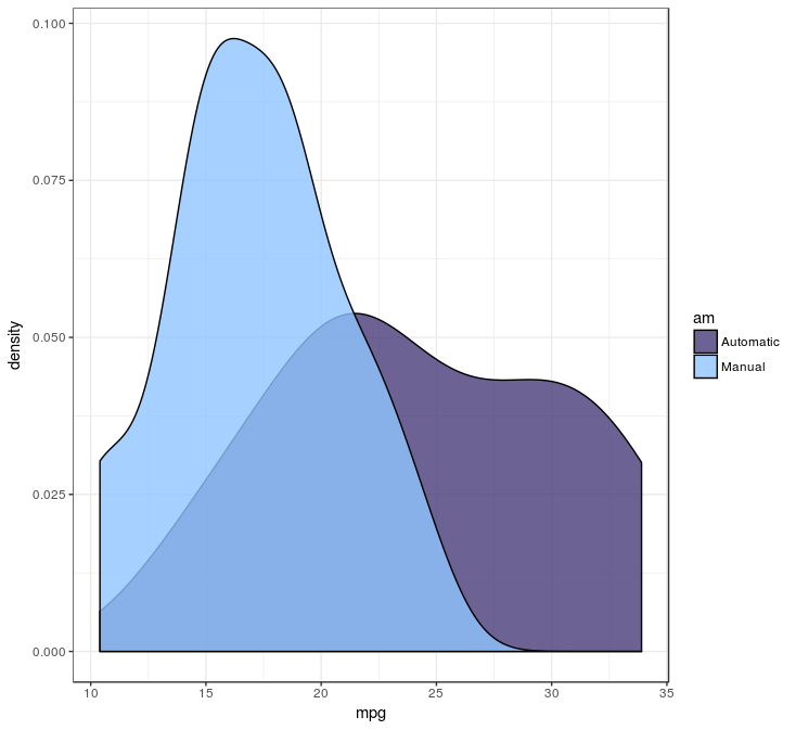
The plot tells us, since the null hypothesis doesn't hold, it is likely the manual transmission cars have lower gas milage.
Kolmogorov-Smirnov test
![]()
The Kolmogorov-Smirnov test tests the same thing as the Mann-Whitney U test, but has a much cooler name; the only reason I included this test here. And I don't like name dropping, but drop this name in certain circles: it will result in snickers of approval for obvious reasons. The ks.test function call isn't as elegant as the wilcox.test function call, but still does the job:
automatic <- ( mtcars %>% filter ( am == 1 )) $ mpg manual <- ( mtcars %>% filter ( am == 0 )) $ mpg ks.test ( automatic , manual ) Output:
Two-sample Kolmogorov-Smirnov test data: automatic and manual D = 0.63563, p-value = 0.003911 alternative hypothesis: two-sided Not surprisingly, automatic and manual transmission cars aren't equal in gas milage, but the p-value is higher than the Mann-Whitney U test told us. This tells us Kolmogorov-Smirnov is a tad more conservative than it's Mann-Whitney U counterpart.
Related samples tests are used to determine whether there are differences before and after some kind of treatment. It is also useful when seeing when verifying the predictions of machine learning algorithms.
Wilcoxon Signed-Rank Test
The Wilcoxon Signed-Rank Test is used to see whether observations changed direction on two sets of ordinal variables. It's usefull, for example, when comparing results of questionaires with ordered scales for the same person across a period of time.
Association between 2 variables
Tests of association determine what the strength of the movement between variables is. It can be used if you want to know if there is any relation between the customer's amount spent, and the number of orders the customer already placed.
Spearman Rank Correlation

The Spearman Rank Correlation is a test of association for ordinal or interval variables. In this example we'll see if vocabulary is related to education. The function cor.test can be used to see if they are related:
library ( car ) cor.test ( ~ education + vocabulary , data = Vocab , method = "spearman" , continuity = FALSE , conf.level = 0.95 ) Output:
Spearman's rank correlation rho data: education and vocabulary S = 8.5074e+11, p-value < 2.2e-16 alternative hypothesis: true rho is not equal to 0 sample estimates: rho 0.4961558 It looks like there is a relation between education and vocubulary. By looking at the plot, you can see the relation between education and vocabulary is a quite positive one.
ggplot ( Vocab , aes ( x = education , y = vocabulary )) + geom_jitter ( alpha = 0.1 ) + stat_ellipse ( geom = "polygon" , alpha = 0.4 , size = 1 ) ![]()
Association measures can be useful more than one variable at a time. For example you might want to consider a range of variables from your data set for inclusion in your predictive model. Luckily the corrplot library contains the corrplot_function to quickly visualise the relations between all in a dataset. Let's take the mtcars variables as an example:
library ( corrplot ) mat_corr <- cor ( mtcars , method = "spearman" , use = "pairwise.complete.obs" ) p_values <- cor.mtest ( mtcars , method = "spearman" , use = "pairwise.complete.obs" ) corrplot ( mat_corr , order = "AOE" , type = "lower" , cl.pos = "b" , p.mat = p_values [[ "p" ]], sig.level = .05 , insig = "blank" ) The matrix mat_corr contains all Spearman rank correlation values, which are calculated with the cor function, passing the whole data frame of mtcars, using the method spearman and only include the pairwise observations. Then the p-values of each of the correlations are calculated using *corrplot**'s cor.mtest function, with the same function arguments. Both are used in the corrplot function, where the order, type and cl.post arguments specify some layout, which I won't go in further. The argument p.mat is the p-value matrix, which are used by the sig.level and insig arguments to leave out those correlations which are considered insigificant below the 0.05 threshold.
![]()
This plot shows which values are positively correlated by the blue dots, while the negative associations are indicated by red dots. The size of the dots and the intensity of the colour show how strong that association is. The cells without dot, don't have significant correlations. For the number of cylinders (cyl) are strongly negatively correlated with the milage per gallon, while the horsepower (hp) is positively associated with the number of carburetors (carb) albeit not as strong.
When you make a correlation martrix like this, be on the lookout for spurious correlations. Putting in variables into your model indiscriminately, without reasoning, may lead to some unintended results…
• 0 CommentsSource: https://mark-me.github.io/statistical-tests-ordinal/
Post a Comment for "What Statistical Test Do I Use for Continuous Numerical Data"